We’ve discussed a handful of new model introduction of this summer in part 1, and will continue with a few other newly launched cars that we think will either hit, miss or just don’t stir our senses at all. This is a series all about opinions on a site totally dedicated to facts, just to balance it off a bit. Here we’ll give our views on new cars and invite you to give yours, be it in the poll at the bottom or in the comment section below. Fortunately, every opinion is personal so even Kriss and I don’t always agree and we hope you don’t either.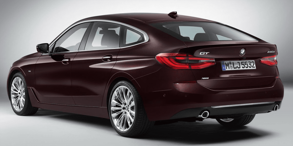
BMW 6-Series Gran Turismo
Bart: hit
I get it, the 5-Series GT, which was actually based on the platform of the 7-Series, has been more of a commercial success than it was an aesthetic success. And by renaming it 6-Series they can make the new generation more expensive, because it has a higher number. Cynicism aside, this car should’ve been called the 6-Series GT since the first generation. And I get why that appealed to the people who’ve bought one: it was more spacious and almost as luxurious and comfortable as a 7-Series for less money, all while being less ostentatious than said 7-Series. And there are plenty of shoppers in this price range who couldn’t care less about the looks of their car, as long as it did best what it’s been bought for. With the new generation they’ve actually succeeded in designing a somewhat graceful car, thanks to stretching it by almost 9cm (3 inches) and lowering it by 2cm (almost an inch), which makes it a lot less bulky than the 5-Series GT. I’m actually starting to warm to this car the more I look at it. And it’s also a great alternative for those who’d love to drive a comfortable BMW and can do without the sportiness that BMW has to put into the 5-Series sedan (and wagon) in order to keep its reputation of maker of sports sedans.
Kriss: so-so
I have mixed feelings about this car. From a rational, sales-oriented perspective, BMW did exactly what it had to do to build on the moderate success of the first generation – it based it on the tour-the-tech new 5-series, made it better-looking (less ugly?), and gave it a posher name. But it remains, at its core, a fundamentally contrived and ungainly car, sort of a 5-series for people who will benefit from the extra space and the easier entry/exit that the higher driving position affords (so, basically, plus-sized and older people). And while the 6-series GT is less environmentally-unfriendly than SUVs, it makes for a much less attractive look on the roads.
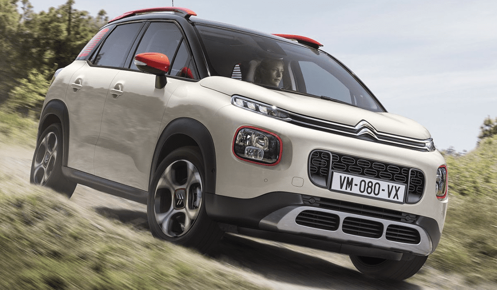
Citroën C3 Aircross
Kriss: so-so
There are two ways to look at the C3 Aircross. Look at it as a model based on the very ungainly Opel Crossland X and you’ll come away thinking that Citroën did an amazing job given the platform – the C3 is much more distinctive, with bold shapes and interesting use of color. But look at it compared to the other small crossovers presented below, and the C3 Aircross is tall and narrow-looking, with very little of the visual aggression afforded to those cars by their sportier, wider stance. As a big fan of the C3 Picasso, which the C3 Aircross indirectly replaces, I mourn the passing of a car with a much purer dedication to space and visibility. But the Aircross makes much more sense for the brand in this crossover-obsessed world, and it should sell rather well.
Bart: hit
I agree with Kriss that the C3 Aircross is a bit too tall and narrow to be really handsome, but that it’s still a hundred times better looking than its platform sibling Crossland X. And I really like Citroën’s new design direction and its courage to be different again, as it should be. The C3 Aircross has a “happy face” without being too “girly” and even the use of contrasting colors around the lights, the door mirrors, roof rack and C-Pillars are exacly enough for it not to become too much of a toy car. I too have had a weak spot for the C3 Picasso, and I totally get why they had to go the crossover-way with the next generation, especially from a commercial point of view, and considering Citroën wants to become less dependent on Europe. In Latin America, there was already an Aircross version of the Picasso and even that actually looked pretty cool. But there’s one big gripe I have with this car: why oh why does it not have Citroën’s signature air bumps in the doors? This would be the perfect model for them, and the doors just look too empty without them, showing too large flat surfaces.
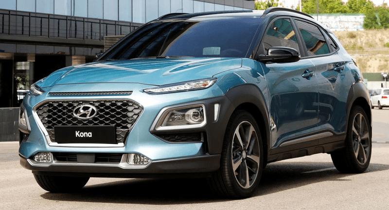
Hyundai Kona
Bart: miss
An attempt at emulating the “success” of the Jeep Cherokee and recent Citroën models, but done badly. Way too busy design, from the front-end, the sides AND the rear. The “double headlight” design works great on the C3 Aircross because the rest of the front is so clean, but on the Kona there are simply too many angles, creases and different materials to make it work. And then there are those fog lights in the lower bumper to make it a total of 6 light units. And what is this strip above the grille? Where the grey plastic wheel arches of the Aircross are evenly shaped and almost symmetrical, those of the Kona are shaped strangely and appear to have been an afterthought in the design “oh wait, we need to add some plastic to make it more rugged”, and while it’s certainly original to have them visually attached to the light fixtures in both front and back, it’s not a design trick that I’d like to see followed by other brands. And that’s too bad, because the general proportions seem to be more appealing than those of the Aircross, and I do like the shape of the rear lights and the “muscular” hood design. But that’s all nullified by way too many shapes, lines and colors that just don’t make a coherent big picture.
Kriss: hit
Here I disagree with Bart. To me the Kona is a rare example of a carmaker still attempting to make a funky car in a segment that was kick-started by a car with very adventurous looks (Nissan Juke), but has since been populated by a whole slew of derivative and altogether less appealing designs. Sure, it is objectively overdesigned, the angles don’t all mesh together and there are, in fact, six light units at the front. But to me that’s fine: just like Marmite/Vegimite, this is a love-it-or-hate-it kind of vehicle, and for Hyundai and our sake I hope it sells well for them.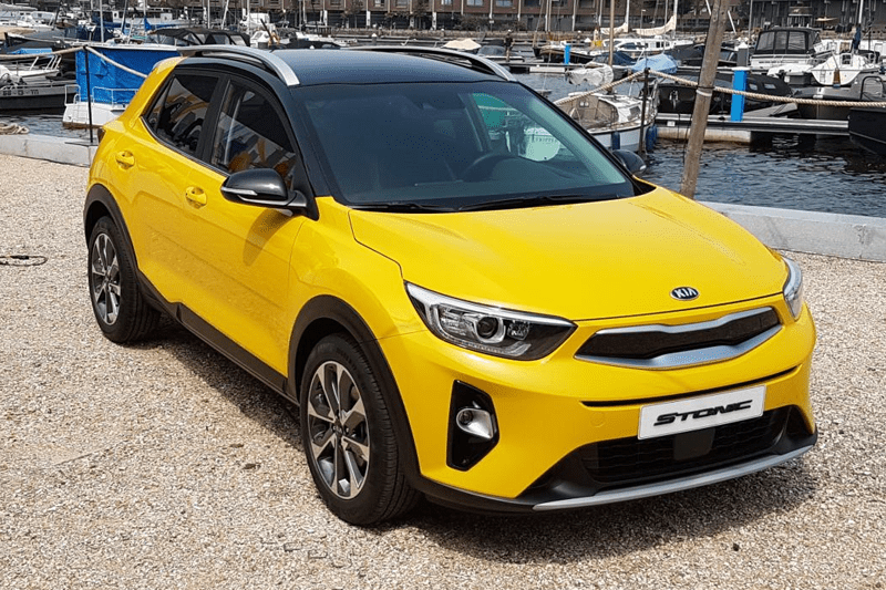
Kia Stonic
Bart: hit
The Stonic has such an entirely cleaner design than the Kona, that I find it extremely hard to imagine the Stonic and its platform sibling come from the same drawing board. I find the Stonic absolutely handsome, easily the best looking Kia of all times (except for the Stinger) for my taste, and one of the few in the segment (and anywhere) on which a contrasting colored roof actually looks good. Whoever decided that having a contrasting colored roof is a must in this segment? Just because the Captur is a commercial succes doesn’t mean that every other player needs to follow in its footsteps. I think for the Stonic it helps that the C-Pillar is in body color, which makes the transition from one color to the other more natural, instead of forced as you’ll see below on the Seat Arona. The Stonic has a confident stance and a clean look with minimal lines, but isn’t boring at all. I’m just not sure what the light grey plastic in its grille will look like in real life, it may look a bit too cheap.
Kriss: hit
I think the Stonic is the perfect fit with its cousin, the Hyudai Kona. Where the Kona is a polarizing design that will deter some, the Stonic (silly name, btw) is conservatively handsome. It will be interesting which one attracts more buyers – while the aggressively styled Nissan Juke kick-started the segment, in time its sales have fallen far behind those of its more conservative competitors.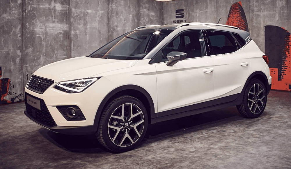
Seat Arona
Kriss: hit
The Arona is a perfect example of what “controlled aggression” is like in design and market-positioning terms. With a design that mixes the conservatively attractive lines of the likes of Leon and new Ibiza with a few more daring slashes/lines, plus a contrasting roof option, the Arona does just enough in my book to clear the “too boring to consider” line, and should sell by the boatload, at least for a Seat.
Bart: hit
Despite being an example of how a contrasting roof doesn’t work, as opposed to the Stonic discussed above, the rest of the Arona looks very sharp. Indeed very youthful and with just enough creases in the sides to break the large surfaces but without becoming too busy, while the black wheel arches are almost too subtle. I like the direction in which Seat’s new design is headed, making it the most attractive brand in the VW Group portfolio, where Skoda is too boring and VW and Audi are too conservative too. I wouldn’t go as far as to call Seat’s recent designs daring, but they’re sharp and clean and stand out from the crowd enough to be recognizable. For a brand whose added value within the Group I doubted just a few years ago, this is an amazing transformation and I think the Arona is exactly the car to emphasize that point as it will indeed be a great seller for Seat. One comment on the proportions: somehow the Arona looks a bit too long, too stretched, especially if you look at the positioning of the rear axle. And I really don’t understand why they haven’t put the frivolity of the exterior into their interiors too, as the dashboard of the Arona is way too much business and way too VW Group for a car in this class.
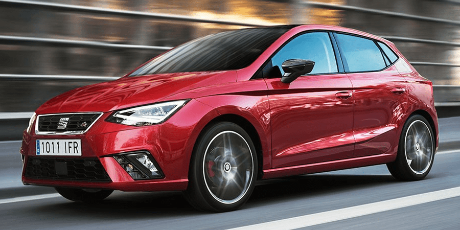
Seat Ibiza
Bart: hit
The new Ibiza is a great leap forward in design from the previous generation, which somehow was out of proportion or just uncoherent, I’ve never been able to lay my finger on why exactly I just couldn’t warm to it, especially the SC 3-door and ST station wagon, which have fortunately been axed with the new model. In fact, I’ve had the same issue with the current Leon, to a lesser degree. The new Ibiza has fixed that with a confident stance due to added width and a visually low center of gravity. It’s muscular rear shoulders work brilliantly too, and I like this car the most when seen from the rear 3/4, as the front 3/4 is a tad too similar to the Leon (which has been on the market for 5 years already!). Oh, and once you see it, it cannot be unseen: the front and rear door handles are not in line. Final comment: just don’t ever get it in that “salmon-beige metallic” color that most of the introduction models had. It looks awful in real life.
Kriss: hit
I think Bart hit the nail on the head – the Ibiza is a huge improvement on the previous one thanks to the wider MQB A0 platform, whose greater width gives the new model a much more planted, aggressive look. While part of me wishes that Seat had dared to move the design further from the 5-year-old Leon, it makes sense for the rejuvenated brand to have brought four of its main models (Leon, Ateca, Ibiza and Arona) in line, before moving the goalpoast with the next Leon. Should sell well for Seat, though I can’t imagine it will be a huge leap over the current model.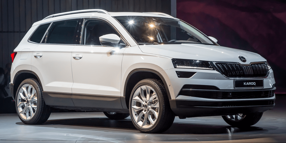
Skoda Karoq
Kriss: so-so
From a business perspective, it makes perfect sense for Skoda to twin its crossovers with Seat cars – first comes the Karoq, a close sister car to the Serat Ateca, and soon Seat will introduce its own version of the Skoda Kodiaq. With reasonable pricing, the Karoq should sell very well for Skoda. However, as a car enthusiast it’s hard not to mourn the passing of the left-field Yeti, whose unique design and compact size differentiated it from the “mee-too” cars in this segment.
Bart: not
As Kriss said, it makes total sense for Skoda to add this car, but boy is Skoda losing out from a design perspective. Could this car be even more sleep-inducing? There’s really not a single exciting line in the Karoq’s design, what a contrast with the attractive Peugeot 3008 against it will be benchmarked. And while Skoda still has an image of value-for-money thanks to the larger-than-segment-average Octavia and Superb, that advantage is not valid for the Karoq, which is sized just average and whose base price in Germany is higher than the 3008 and Kuga, which are both larger.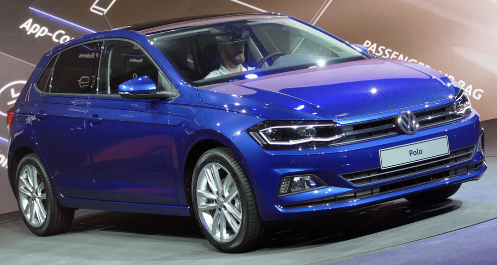
Volkswagen Polo VI
Bart: so-so
Like the Ibiza which shares the same platform, the new Polo looks bulkier and has a more confident stance than the outgoing model. In fact, it looks even more like a mini-Golf than ever. They’ve even managed to add a little frivolity to the sides: the line that runs “through” the door handles turns into the line above it at the front wheel arches. This is unheard of for VW! Such courage, what were they drinking when they decided that? Sarcasm aside, I like the new Polo. It was never meant to be the most exciting car in its class and never will be, but for what it’s supposed to be (the best seller), they’ve actually done a great job. It will appeal to the masses and offend nobody, perfectly middle of the road. This means it’s a guaranteed commercial success, even if it’s just for the name and its conservative design. Spend heavily on a high-end version with added R-Line design and while expensive “for its class”, you’ll have more than enough car than most people will ever need. Just don’t expect to find one in my driveway, I’d prefer the Ibiza.
Kriss: so-so
To me the new Polo is both testimony to the success of VWs strategy of making its cars that little bit more desirable than the average competitor, as well as evidence of how hard it is for those in the lead to continue innovating. Essentially more of a shrunken Golf than an updated previous-generation model, the latest Polo tries very hard to look like its larger brother without upstaging it in visual terms. So while the Golf gets a very well-resolved look, the Polo grafts on a more pedestrian interpretation of the same design themes onto the new MQB A0 platform. In fact, I feel that if it were not for the new, wider platform, the new Polo would look worse than the old one, mainly due to the loss of that car’s subtly flared wheel arches and vertical line running down the wide between the wheels, but also because like BMW VW decided to experiment with a funky concave/convex character line above the door handles, a design element that I am really not fond of…