 As one of the leading websites dedicated to car sales (with over 300.000 monthly views from readers all over the world) and with one of the largest databases on car sales data (with historic and current data of over 2.500 different models across 3 continents and as far back as 6 decades), it is our mission at CarSalesBase.com to continually look for ways to give our readers more and easier ways to find the information they’re looking for. We’re happy and proud to introduce the latest result of this quest: a car sales comparison tool that allows you to visually compare annual car sales from all available brands and models in Europe, the US and China in a graph. Our tool lets you pick up to 8 different models or brands to compare, from as far back as 1961, and give you a visual of their annual sales, in addition to a table with the exact data.
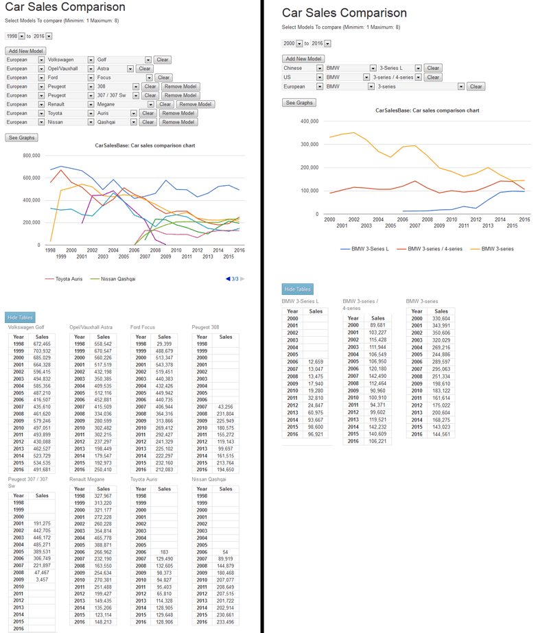
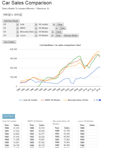
For example: compare Ford Focus sales in Europe with those of the same model in the US and China. Or compare BMW 3-Series sales in Europe with those of up to 7 competitors. Graphically display the growth of the Mercedes-Benz brand in three continents. You can decide what you want to compare and for which time period. Check out the comparison tool at carsalesbase.com/car-sales-comparison (or use the “Comparison Tool” button in the top menu) and let us know what you think. Send us a note if you think we can improve the tool or the functionality, or just let us know if you like it. Also, if there’s anything else we can do to improve your experience on our website, please let us know, we can only serve you better if you tell us what you’re looking for and what you want from us.
Enjoy using the tool and experimenting with it, but we warn you: from personal experience we know it can be a bit addictive, so use with care 🙂
The standard settings are 3 models to be compared from 2000 to 2016. Use the dropdown select boxes to select a different time period. Use the “add new model” button to add more than the standard 3 options, up to 8, and use the “remove model” button to reduce the number of options. Use the “Clear ” button to clear a selected field, or just select another model. Click on the “show tables” button below the graph to display the tables, and use the arrows to see the rest of the legend when more than 3 models are selected.
Here are a few more examples of how to use the tool: